📖 What's in This Guide
What Font Style Actually Means on Instagram
None of these are fonts in the traditional sense. Instagram doesn't let you install anything or change a system setting. What you're actually seeing is something different: a set of Unicode characters that were built into the standard character set every device already understands, arranged to visually resemble bold letters, script letters, or a dozen other letterforms, without being letters in the traditional sense at all.
That's the whole trick behind why these work everywhere. A real font needs to be installed to display correctly. A Unicode character just needs to exist in the text, and your phone, laptop, or friend's phone all read it the same way, since it's baked into the same global character standard rather than tied to one app or one operating system.
It also explains a quirk worth knowing early: letters like Q or X sometimes look slightly different or don't change at all in certain styles. That's not a mistake in the generator, it's because the character set behind some styles simply never included a stylized version of every single letter.
One more thing worth keeping in mind: if someone types your plain name into Instagram to look you up, a heavily styled version won't always match as easily, since the app compares exact characters rather than how the name looks to a human eye. That's not a reason to avoid styling your name, it's just a reason to keep your plain name somewhere findable too, in your bio or as a mention in a post, if being easy to find matters to you.
The Main Font Styles You Can Use
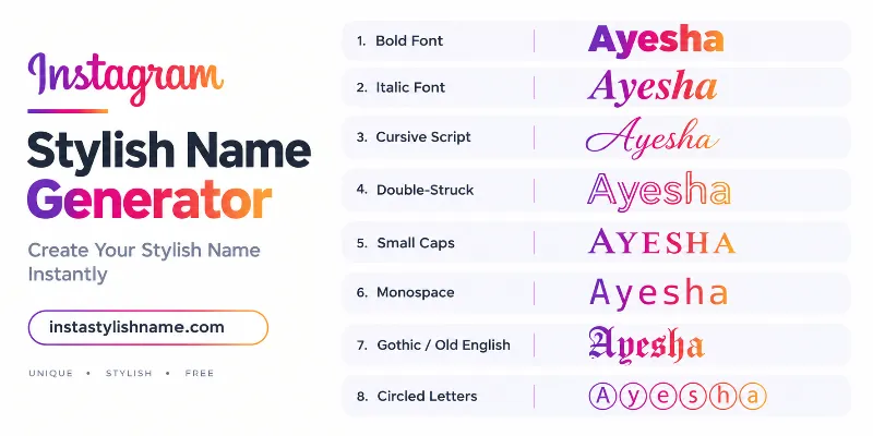
Here's the full lineup, with a real sample of each one so you can see it rather than imagine it.
Bold
Thick, heavy strokes make bold the single most recognizable style on this list. It reads as confident and direct without adding any symbols at all, which makes it a strong default when you're not sure what else to pick.
Italic
A gentle forward lean gives italic a slightly more personal, handwritten feel than bold, while still staying easy to read. It works well for a softer alternative that doesn't go all the way to a full script style.
Cursive Script
Script brings in loops and flowing connections between letters, closer to handwriting than typed text. It suits fashion, beauty, and personal profiles particularly well, though it can get harder to read in very short names, so it's worth testing before committing.
Double-Struck
Originally used in mathematics for special number sets, double-struck letters have an outlined, almost hollow look that reads as modern and sharp. It's a favorite for gaming and bold personal styles precisely because it looks nothing like ordinary text.
Small Caps
Every letter appears as a smaller version of a capital letter, giving a clean, quiet, slightly formal look. This is one of the most readable styles on the list, which makes it a solid choice for a business account or anywhere a loud font would feel out of place.
Monospace
Every character takes up exactly the same width, the same look used in code editors and old typewriters. It gives a name a technical, structured feel, and it pairs particularly well with gaming or tech-themed profiles.
Old English
Also called Gothic or Fraktur, this style pulls from medieval manuscript lettering, dense and dramatic. It carries the strongest personality of anything on this list, which means a little goes a long way, this works best on its own rather than combined with several symbols.
Circled and Bubble Letters
Each letter sits inside its own circle, giving a playful, rounded look that stands apart from every other style here. It suits casual, friendly profiles well, though longer names can start to look crowded, since every letter takes up visible extra space.
Full-Width
Every letter and number gets stretched to occupy equal, wider spacing, giving text a distinct, deliberate feel without changing the actual letterforms much. Originally built for East Asian typography, it's picked up a following simply because it looks unusual without sacrificing readability.
Underline
Rather than replacing the letters themselves, this style adds a line beneath each character individually. It gives a plain font a signed, finished look, and it works well layered on top of a name that's already simple, since it adds emphasis without adding a whole new letterform.
Quick Reference
A short summary of every style covered above, useful if you already know the mood you want and just need to match it to a name.
| Style | Feel | Best suited for |
|---|---|---|
| Bold | Strong, confident | General use, gaming, fitness |
| Italic | Personal, gentle lean | Softer alternative to bold |
| Cursive Script | Elegant, flowing | Fashion, beauty, lifestyle |
| Double-Struck | Sharp, outlined | Gaming, bold personal branding |
| Small Caps | Clean, quiet | Business, professional profiles |
| Monospace | Technical, structured | Gaming, tech-themed profiles |
| Old English | Dramatic, dense | Standalone statement names |
| Circled | Playful, rounded | Casual, friendly profiles |
| Full-Width | Wide, deliberate | Understated but distinct names |
| Underline | Signed, finished | Adding emphasis to a simple name |
Matching a Font Style to Your Profile
The style that fits your name depends entirely on what your profile is actually for, not which one looks best in isolation.
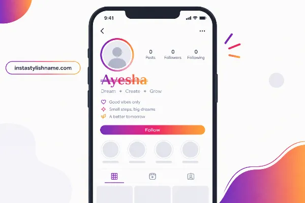
A personal or professional account usually holds up best with small caps, sans-serif, or a plain bold, styles that stay closest to normal letters and read instantly. A gaming or esports profile leans naturally toward double-struck or monospace, since both carry a sharper, more technical edge. A fashion, beauty, or lifestyle account tends to suit script or italic, softer styles that feel more personal. A profile built around a stronger, edgier identity often reaches for Old English, though it's worth using sparingly given how much visual weight it carries on its own.
There's no single correct answer here. The same name can genuinely work in three or four different styles depending on the mood you're going for, which is exactly why it's worth trying more than one before settling.
Common Mistakes When Picking a Font Style
Mixing multiple styles in one name
Combining bold letters with script letters and a circled letter thrown in usually reads as cluttered rather than creative. One style, all the way through, holds together far better.
Choosing a style you can't actually read back
A name that looks impressive for two seconds but takes a stranger ten seconds to decode has traded away its most basic job. If you have to squint at your own name, so will everyone else.
Ignoring how it looks on other devices
Not every character in every style displays identically across every phone. Our homepage guide covers this in more depth, worth a read if you want to understand exactly why that happens.
Picking a style that clashes with the profile's actual content
A children's account with heavy gothic lettering, or a business page in bubble letters, sends a mismatched signal before a visitor reads a single word of the bio.
Assuming every style looks identical on every screen
Most do, but a small number of characters render slightly differently depending on the device. If a style looks slightly off to a friend, it's almost always a device difference rather than something wrong with your name.
Overlooking Superscript and Strikethrough options
Both are available in the generator and can add subtle emphasis without changing the entire letterform, making them useful for short words or highlights within a longer name.
Where to Actually Create These Styles
Every style shown on this page can be generated instantly using the tool on our homepage, which also includes name styles built specifically for boys, girls, a bolder attitude direction, and font pairing advice for your bio. This page exists purely as the reference, so you know exactly what you're choosing before you go generate it.
Ready to try a style? Head to the Instagram Stylish Name Generator and see your own name in every font style instantly.
Frequently Asked Questions
Are Instagram font styles real fonts?
No. They are Unicode characters that look like different letterforms, not fonts installed on a device, which is why they work the same way on any phone or computer.
Which Instagram font style is easiest to read?
Small caps and sans-serif styles stay closest to normal letters, so they read the fastest at a glance compared to script or Old English styles.
Can I use more than one font style in the same name?
You can, but one font style through the whole name almost always looks cleaner than mixing two or three together.
Why does a font style sometimes show up as a box or question mark?
That happens when a specific device doesn't support that particular character. Trying a different font style from the same list usually solves it.
Which font style works best for a business account?
Sans-serif, small caps, or monospace styles read as more professional, since they stay closer to plain, familiar letterforms.
Will a stylish font make my name harder to find on Instagram?
It can. If someone types your exact plain name to look you up, a styled version may not match directly, so it helps to keep a plain reference to your name somewhere on your profile if that matters to you.